



What real pictures of planets in space can and cannot show
Pictures of planets in space are not only striking astronomy visuals. They are records made by spacecraft, orbiters, flybys, rovers, and space telescopes, often at wavelengths the human eye cannot see. No single image shows a planet exactly as a person would see it from a nearby spacecraft window. Some views are close to natural color. Others are enhanced to bring out clouds, minerals, rings, haze, or surface structure. Infrared and radar products may translate invisible measurements into visible colors so scientists can study them. For more context on planetary missions and astronomy coverage, visit our Space Science section.
As of October 24, 2026, the solar system’s eight recognized planets remain Mercury, Venus, Earth, Mars, Jupiter, Saturn, Uranus, and Neptune. Pluto is classified as a dwarf planet under the International Astronomical Union definition adopted in August 2006. That distinction matters for readers searching for planet pictures, because online galleries often place planets, dwarf planets, moons, asteroids, educational graphics, and artist concepts in the same collection.
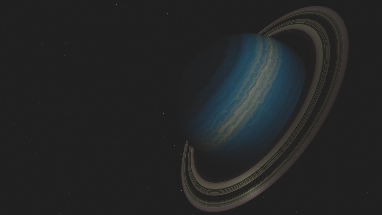
Why planet pictures often look different from one source to another
A common question follows many planetary image releases: is this what the planet really looks like? The careful answer is that the image is usually based on real data, but the color and contrast may have been processed for a specific purpose. Planetary scientists use filters, exposure settings, mosaics, calibration steps, and contrast adjustments to turn measurements into readable images. Those choices can highlight storms on Jupiter, rings around Uranus, methane clouds on Neptune, dust on Mars, or surface features beneath Venusian clouds.
These are the main image types readers are likely to encounter:
- Natural-color or approximate true-color images are processed to resemble what the human eye might see under similar viewing conditions.
- Enhanced-color images strengthen subtle differences so scientists can separate clouds, haze, ice, minerals, or atmospheric layers.
- False-color images assign visible colors to wavelengths humans cannot see, such as infrared or ultraviolet.
- Radar images are especially important for Venus, where thick clouds block direct optical views of the surface.
- Composite images combine multiple exposures, filters, or observing sessions and may not represent a single moment in time.
This does not make the images fake. It means they are scientific visualizations built from real measurements. A Webb infrared image of Saturn or Neptune, for example, can reveal ring structure or high-altitude haze that would not appear the same way in a visible-light snapshot. A Hubble view of Jupiter can preserve a long-term record of atmospheric change. A Mars rover image can show rocks and dust from ground level, while an orbiter mosaic places those local scenes into a wider planetary map.
How each planet appears in spacecraft and telescope images
Mercury
Pictures of Mercury show a cratered, gray world that can resemble the Moon at first glance. The resemblance is partly visual: both worlds preserve heavy impact scars. Mercury has very little atmosphere to soften incoming impacts or drive Earth-like weathering, so craters and basins remain central features in global images. Spacecraft imaging has also shown cliffs and scarps that point to the planet’s geologic contraction over time.
Venus
Visible-light pictures of Venus mostly show a smooth, bright cloud deck rather than the surface. That is why many surface maps of Venus are based on radar instead of ordinary photography. Radar can penetrate the planet’s thick atmosphere and map volcanoes, plains, highlands, and impact structures. When readers see colorful Venus surface images, they are often looking at radar-based data, elevation shading, or a scientific rendering rather than a direct camera photo of the ground.
Earth
Earth is the planet most often photographed from orbit, by deep-space missions, and by astronauts. Its images carry scientific value because clouds, oceans, land, ice, and atmospheric scattering can be observed together. Planetary scientists often use Earth as a comparison point for studying climate, weather, oceans, and habitability elsewhere. Pictures of Earth from space are also not static portraits. They record changing weather systems, seasons, wildfires, storms, sea ice, and human activity.
Mars
Mars is one of the most photographed worlds beyond Earth because it has been visited by orbiters, landers, and rovers. Orbital pictures reveal volcanoes, valleys, dunes, polar caps, impact craters, and dust storms. Surface pictures add scale, showing pebbles, layered rocks, wheel tracks, dust-coated panels, and horizon views. The red and tan colors come largely from iron-rich dust and oxidized minerals, although Mars images vary with lighting, camera calibration, and processing choices.
Jupiter
Jupiter’s images are defined by bands, storms, turbulence, and scale. Its Great Red Spot remains the best-known feature, but high-resolution views also show smaller vortices, complex cloud boundaries, polar cyclones, and auroras. The James Webb Space Telescope’s infrared views have added another layer, showing high-altitude auroral emissions, hazes, and faint ring features that are difficult to capture in ordinary visible-light imagery. In May 2025, NASA reported new Webb details in Jupiter’s auroras, emphasizing that images can still reveal fresh behavior on a planet observed for centuries.
Saturn
Saturn’s ring system makes it one of the most recognizable planets. Images from missions such as Cassini changed public understanding of the planet by showing ring gaps, shadows, storms, moons, and seasonal changes. Infrared observations by Webb provide different information, including how the rings and atmosphere behave at wavelengths outside human vision. A Webb infrared image captured on November 29, 2024, later highlighted the planet’s icy rings and layered atmosphere, showing why modern planetary photography is often multi-wavelength science rather than a single-color portrait.
Uranus
Uranus can appear deceptively plain in older visible-light images because haze and methane absorption mute many features. Newer infrared imaging has made it easier to see rings, bright clouds, and the planet’s seasonal polar region. Webb’s 2023 views of Uranus showed the planet’s rings with notable clarity and captured details including the faint Zeta ring, a diffuse inner ring that is difficult to observe. These images help explain why a planet that once looked like a simple blue-green disk is scientifically active and visually complex when observed in the right wavelengths.
Neptune
Neptune’s famous Voyager 2 images from 1989 introduced many readers to the outermost recognized planet in close detail. Webb’s 2022 image provided one of the clearest modern views of Neptune’s rings in decades, including faint dust bands and several moons. Neptune’s blue appearance in visible light is linked to atmospheric methane and other atmospheric effects, but infrared pictures can make the planet look pale or bright in unexpected ways. The difference is not a contradiction. It reflects how various wavelengths interact with methane, clouds, and ice particles.
A quick guide to reading planetary image labels
Planet pictures are easier to interpret when readers slow down and read the caption. A caption can show whether an image is a single exposure, a mosaic, an enhanced-color view, an infrared observation, or a model based on data. This distinction is especially important online, where real spacecraft images, educational renderings, and artist concepts often circulate side by side.
| Label or phrase | What it usually means | Why it matters |
|---|---|---|
| Approximate true color | Processed to look broadly similar to human vision | Useful for public interpretation, but still calibrated and adjusted |
| Enhanced color | Color differences are strengthened | Helps reveal clouds, minerals, ice, or atmospheric layers |
| False color | Invisible wavelengths are assigned visible colors | Excellent for science, but not a naked-eye view |
| Infrared | Shows heat-sensitive or wavelength-specific features beyond visible light | Can reveal rings, haze, auroras, and cloud heights differently |
| Mosaic | Multiple frames are stitched into one image | Improves coverage, but may combine observations taken over time |
| Artist concept | An illustration based on data or theory | Not a photograph, even when scientifically informed |
One practical rule is straightforward: if an image shows a highly detailed exoplanet surface, a dramatic close-up of a distant planet around another star, or a perfect lineup of planets with equal lighting and scale, it is likely an illustration or a composite. That can still be useful, but it should not be confused with direct photography.
Why exoplanet pictures are much rarer than solar system images
Most pictures of planets in space show worlds inside our own solar system. Exoplanets are far more difficult to photograph directly because they are faint, distant, and usually close to much brighter stars from our point of view. Astronomers often discover exoplanets by measuring a star’s dimming during a transit or by detecting a star’s wobble, not by taking a conventional picture of the planet. See also: AI.
Directly imaged exoplanets do exist, but they are unusual cases. They tend to be young, large, hot, and far enough from their host stars for telescopes to separate the planet’s light from the star’s glare. Webb’s first direct image of an exoplanet, released in 2022, showed HIP 65426 b in multiple infrared wavelengths. NASA’s exoplanet catalog describes HIP 65426 b as a gas giant discovered in 2017, with a mass around nine times Jupiter’s and an orbit far from its parent star. Those traits made it a more favorable target than a small rocky world close to a Sun-like star.
This is why many exoplanet images used in articles, documentaries, and social media posts are labeled as artist concepts. They may be based on real measurements of mass, size, orbit, temperature, or atmosphere, but they are not photographs in the same sense as a Mars rover panorama or a Voyager image of Neptune. Readers should look for wording such as “illustration,” “artist’s impression,” or “simulation” before treating an exoplanet image as a direct observation.
What recent telescope images have added to planetary science
Modern planetary imaging is not only about sharper pictures. It is about observing the same world across time and wavelength. Hubble’s long-running observations of the giant planets have helped track atmospheric changes on Jupiter, Saturn, Uranus, and Neptune over years. Webb has added infrared sensitivity that is especially useful for rings, auroras, high-altitude haze, methane-rich atmospheres, and some exoplanet observations.
A short timeline shows how the information value has grown:
| Period | Image milestone | Information gained |
|---|---|---|
| 1970s to 1980s | Flybys by spacecraft such as Voyager | First close planetary views for the outer solar system |
| 1990s to 2010s | Hubble and dedicated planetary missions | Long-term atmosphere monitoring and high-resolution mission imaging |
| 2004 to 2017 | Cassini at Saturn | Detailed study of Saturn, rings, moons, storms, and seasonal changes |
| 2022 onward | Webb infrared observations | New views of rings, auroras, ice giants, and selected exoplanets |
| 2020s | Rover, orbiter, and telescope image archives | More public access to raw and processed planetary data |
The editorial takeaway is that pictures are becoming more diagnostic. A planet image can help answer questions about atmospheric circulation, ring particles, polar chemistry, storm evolution, surface geology, and telescope performance. That is why a new planetary picture should be read as a data product as well as a visual spectacle.
How to find reliable planet pictures without being misled
Readers looking for reliable planet images should prioritize official mission archives, space agency image libraries, and captions that clearly identify the instrument, date, target, wavelength, and processing method. NASA’s Planetary Photojournal, NASA’s Image and Video Library, ESA/Hubble releases, Webb telescope releases, and mission-specific archives are common starting points for verified material. Educational galleries can also be useful when they distinguish clearly between real images and illustrations.
Before sharing a dramatic planetary image, check four details:
- Source: Is it from a mission team, space agency, observatory, journal, or reputable science outlet?
- Caption: Does it explain the spacecraft, telescope, instrument, wavelength, and processing?
- Scale: Are the planets shown at true relative size, or arranged for design clarity?
- Image type: Is it a photograph, data visualization, mosaic, radar map, simulation, or artist concept?
These checks matter because planetary images are frequently reposted without context. A false-color scientific image may be mislabeled as a natural view. A polished artist concept may be presented as a telescope photograph. A solar system poster may place planets close together even though the true distances are vast. Good captions prevent confusion and make the image more useful.
Frequently asked questions
Are pictures of planets in space real?
Many are real images based on spacecraft or telescope data, but they may be processed, color-enhanced, or assembled from multiple exposures. Some widely shared planet visuals are artist concepts or educational composites, so the caption is essential.
Why do planets look different in NASA, ESA, and telescope images?
Different instruments observe different wavelengths and use different filters. Visible-light, infrared, ultraviolet, and radar observations can make the same planet look very different while still representing real data.
Can we see pictures of planets outside our solar system?
Yes, but direct exoplanet images are rare. Most known exoplanets are detected indirectly, and many published exoplanet visuals are artist concepts rather than photographs.
Why does Neptune sometimes look deep blue and sometimes pale?
Color depends on the instrument, wavelength, and processing. Visible-light views emphasize one appearance, while infrared images can show methane absorption, clouds, rings, and moons in very different ways.
Do solar system posters show the planets at real distance?
Usually not. Most posters and web graphics compress distances so all planets can fit in one image. True-scale distance diagrams require enormous empty space between the planets.